Developer Productivity
Productivity in SEI 2.0 focuses on understanding the actual work being delivered by developers, the quality of that work, and how effectively teams collaborate to get it done. Rather than measuring activity for its own sake, SEI 2.0 surfaces signals that reflect meaningful engineering output, including work that drives value, improvements to existing code, and areas of potential rework.
Productivity Insights
The Productivity tab on the Insights page in SEI 2.0 helps you understand how work flows through your engineering organization, focusing on the quality, velocity, and collaboration behind the code. If your account has multiple Org Trees configured in SEI 2.0, the Org Trees are displayed as tiles at the top of the dashboard.
Selecting an Org Tree tile updates the dashboard to reflect data for that org tree and filters all productivity metrics to only include the teams and repositories within the selected Org Tree. This allows you to analyze productivity trends across different organizations and teams.
By surfacing key aspects of the development lifecycle, the Productivity Insights dashboard helps teams:
- Understand how engineering effort translates into delivered outcomes
- Identify bottlenecks, rework, or inefficient collaboration patterns
- Track productivity trends at the individual, team, or organizational level
- Focus improvement efforts on the areas with the highest impact
You can analyze the data by selecting a time range (for example, the last several weeks or months) and a time granularity (weekly, monthly, or quarterly), which determines how the data is grouped and displayed in the charts.
Use the Showing dropdown menu to control how values are calculated across all widgets. Available options include mean, median, p90, and p95. Click the Show trendline checkbox to overlay trendlines across all Productivity visualizations. Trendlines help you assess whether productivity metrics are improving, regressing, or remaining stable over time.
Trendlines use the Ordinary Least Squares (OLS) regression method to identify patterns and direction in your data over the selected time range.
To export the Productivity Insights dashboard data, click the kebab menu (⋮) and select Export as PDF or Export as CSV. For more information, see Exporting SEI 2.0 Insights.
Below is a brief overview of each widget in Productivity on the Insights page:
PR Velocity Per Dev
PR Velocity per Dev represents the average number of pull requests a developer merges in a given time period. It helps you understand how frequently developers are shipping code.
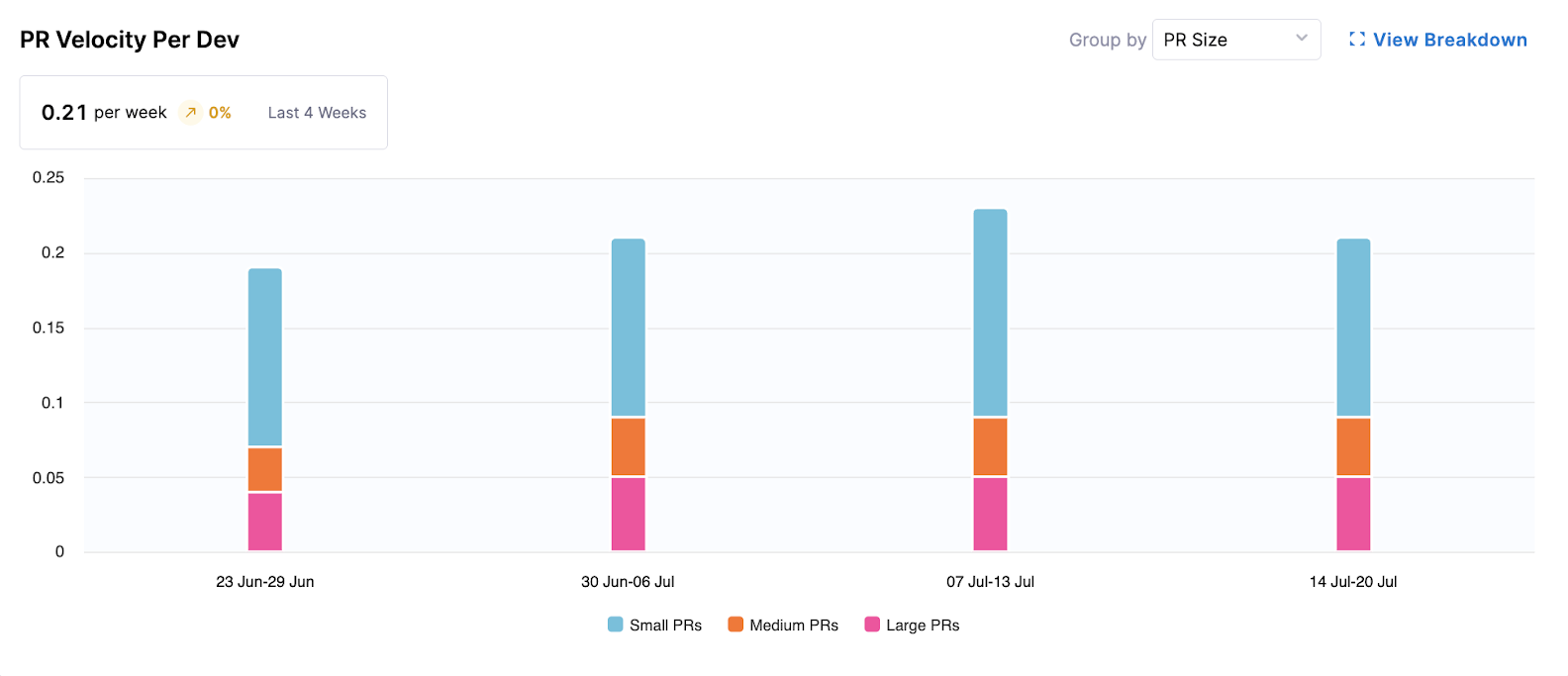
This widget provides insights into the productivity of individual developers and teams by visualizing the rate at which pull requests (PRs) are completed over time.
- Metrics Displayed: Average PRs merged per developer per week (e.g., 0.13 per week).
- Visualization: A bar chart showing completed PRs per developer per week, segmented by "PR Size" (Small, Medium, Large) or "Work Type" (e.g., Features, Bugs).
The following options are available for this widget:
- Group by: Allows switching the segmentation between PR Size and Work Type.
- View Breakdown: Provides a detailed breakdown of PR velocity by teams or individual developers, and offers a drill down to specific PRs.
Understanding PR Velocity
This visualization shows the rate at which pull requests (PRs) are merged over time. On the X-axis is the date (weekly, monthly, or quarterly); on the Y-axis is the number of PRs merged per developer.
PRs are grouped by size (Small, Medium, and Large) based on lines of code changed as defined in your Productivity Profile.
High-performing teams typically average 1-5 PRs per developer per week. Focus on maintaining a steady, sustainable cadence rather than maximizing volume.
To improve PR Velocity, Harness recommends breaking work into smaller changes, reducing pull request sizes, and encouraging consistent delivery. Setting strict PR quotas may lead to artificial or low-quality contributions.
PR Cycle Time
PR Cycle Time measures how long it takes for a pull request to progress from the first commit included in the PR through PR creation and merge. This highlights delays across the development and review process and helps identify where workflow friction occurs.
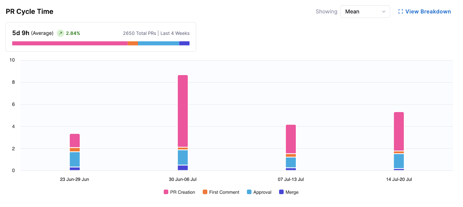
This widget visualizes the average time it takes for pull requests (PRs) to move from the first commit through PR creation to merge. It helps identify bottlenecks in the PR review and merge process by capturing both coding delays (time between the first commit and PR creation) and review delays (time between PR creation and merge), including time spent in all tracked stages such as coding, review, and other workflow steps.
- Metrics Displayed: Average time (e.g., 5d 11h) over the selected period.
- Visualization: A bar chart showing PRs per week, segmented by time spent in stages: PR Creation, First Comment, Approval, and Merge.
The following options are available for this widget:
- Showing Mean: Displays the average cycle time.
- View Breakdown: Provides a more granular view, typically by team or individual, and includes a table drill down of individual PRs.
Understanding PR Cycle Time
This visualization measures how long it takes for a pull request to move from initial commit to merge. It includes stages such as PR creation, first comment, approval, and final merge. On the X-axis is the average cycle time; on the Y-axis is the date (weekly, monthly, or quarterly).
High-performing teams often average around two days, but trends matter more than exact values. Extremely low cycle times may indicate skipped steps such as missing code reviews.
To improve PR Cycle Time, Harness recommends keeping PRs small and focused, prioritizing timely code reviews, and implementing automated checks to reduce back-and-forth with reviewers.
Work Completed Per Developer
Work Completed per Developer measures how much meaningful work (such as features, bugs, or uncategorized work) each developer completes in a given time period. It helps you understand output patterns and delivery consistency across teams.
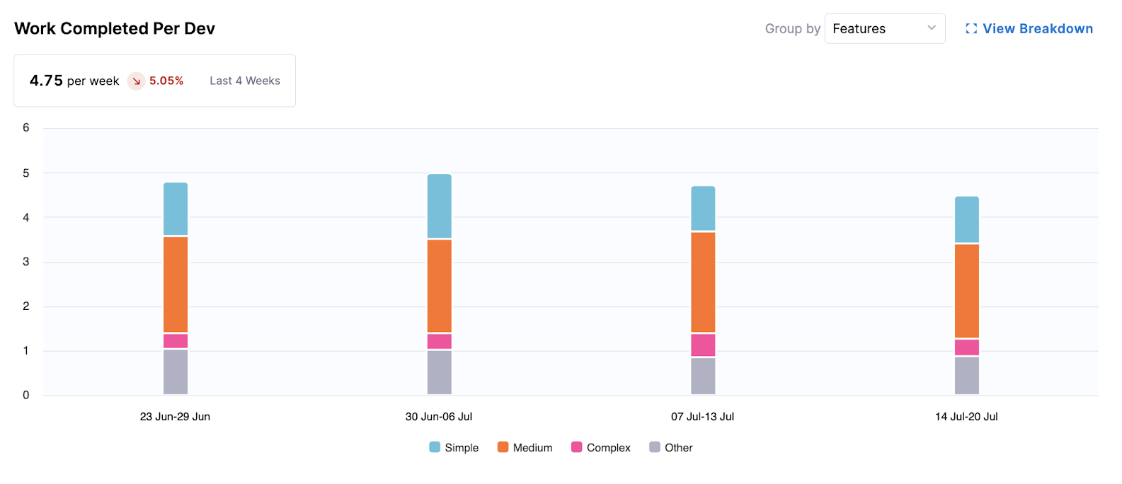
This widget tracks the amount of completed work (e.g., features, bugs) per developer over time, offering insights into the output generation.
- Metrics Displayed: Average completed work units per developer per week (e.g., 0.23 per week).
- Visualization: A bar chart showing work completed per developer per week, segmented by complexity: Simple, Medium, Complex, and Other.
The following options are available for this widget:
- Group by: Allows you to change the segmentation, for example, by Features.
- View Breakdown: Provides a more detailed view by team or individual developers, often with a table drill down of specific completed items.
Understanding Work Completed per Developer
This visualization shows the average number of tickets completed per developer over time. On the X-axis is the date (weekly, monthly, or quarterly); on the Y-axis is the number of completed tickets per developer.
Work is grouped by complexity (Simple, Medium, and Complex) based on story point definitions on the Issue Management tab in Team Settings.
Most teams typically complete 3-5 tickets per developer per week, though this varies based on work type and complexity. Focus on improving trends relative to your team’s baseline rather than comparing across teams.
To improve Work Completed Per Developer, Harness recommends breaking down large tickets into smaller, manageable tasks and ensuring work is structured clearly (for example, by using epics with smaller child tickets).
Coding Days Per Developer
Coding Days per Developer represents the number of distinct days in which a developer made at least one meaningful code contribution (a commit).
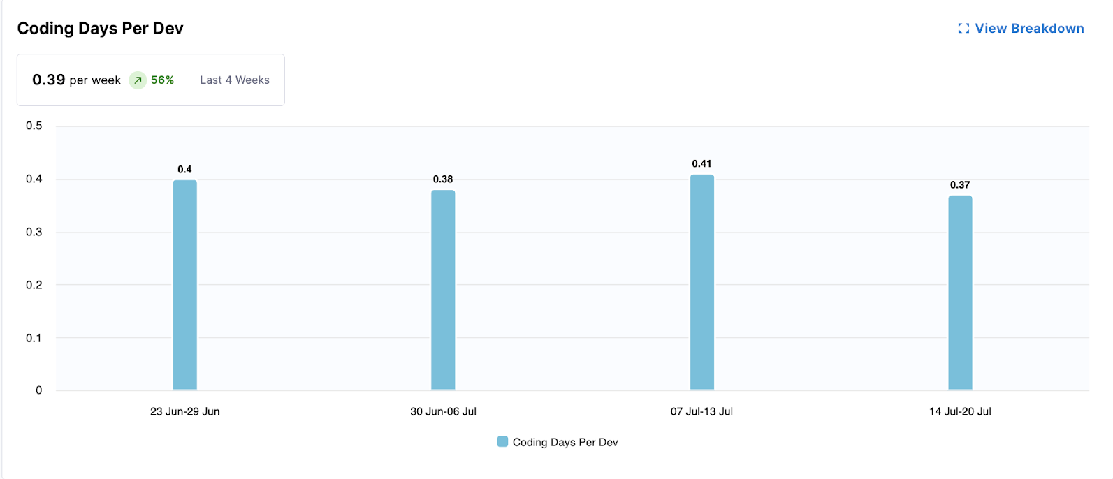
This widget measures the average number of days developers actively contribute code, indicating consistent engagement and direct contribution volume.
- Metrics Displayed: Average coding days per developer per week (e.g., 0.23 per week).
- Visualization: A bar chart showing the average coding days per developer for each week.
The following options are available for this widget:
- View Breakdown: Provides a detailed breakdown of coding days by team.
Understanding Coding Days per Developer
This visualization measures the number of distinct days per week that a developer makes at least one code contribution. On the X-axis is the date (weekly, monthly, or quarterly); on the Y-axis is the average coding days per developer.
A typical benchmark is around 3-4 coding days per week. Lower values may indicate large, infrequent commits, while consistently high values (for example, 6-7 days) may signal overwork or burnout risk.
To improve Coding Days Per Developer, Harness recommends encouraging smaller, more frequent commits and looking out for signs of excessive workload across the team.
Number of Comments Per PR
Number of Comments per PR tracks the average volume of review discussion (comments) on pull requests. SEI counts all review comments (including inline comments and general) on each PR, then averages this across all PRs merged in the selected time period.
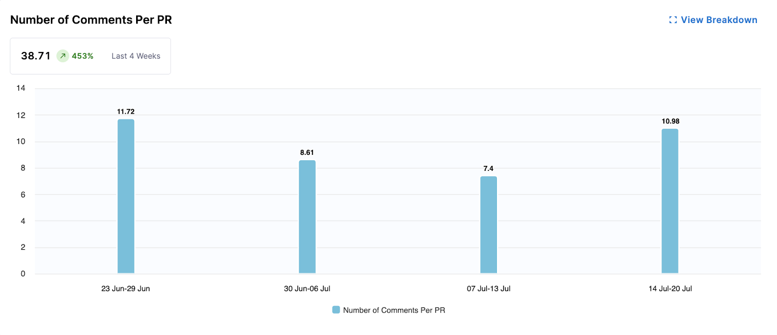
This widget gauges the level of collaboration and communication within PRs by tracking the average number of comments per pull request. More comments can indicate active discussion and thorough reviews.
- Metrics Displayed: Average number of comments per PR (e.g., 2.5 comments).
- Visualization: A bar chart showing the average number of comments per PR for each week.
The following options are available for this widget:
- View Breakdown: Provides a detailed breakdown of comment activity by team.
Understanding Comments per PR
This visualization shows the average number of comments per pull request. On the X-axis is the date (weekly, monthly, or quarterly); on the Y-axis is the number of comments per PR.
This metric reflects review engagement rather than code quality. Most PRs should include at least one review comment or approval note.
To improve Number of Comments Per PR, Harness recommends encouraging teams to leave feedback directly on PRs to support knowledge sharing and maintaining a clear review history. PRs with no comments may indicate that reviews are happening outside the platform.
Average Time to First Comment
Average Time to First Comment measures how quickly reviewers respond to new pull requests. It reflects team responsiveness and the overall efficiency of the review workflow.
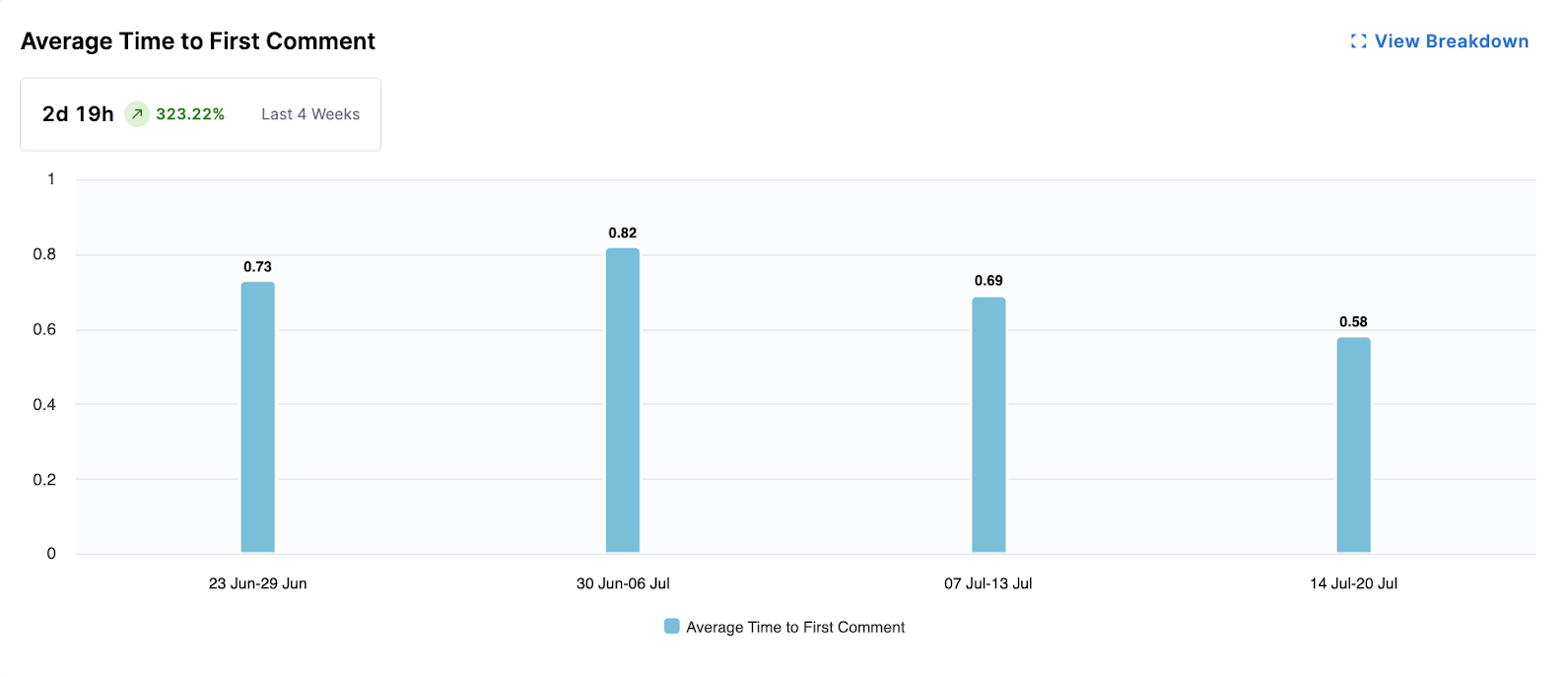
This widget measures the responsiveness of the team by calculating the average time it takes for a pull request to receive its first comment. Faster first comments can indicate efficient review processes.
- Metrics Displayed: Average time to first comment (e.g., 3d 8h).
- Visualization: A bar chart showing the average time to first comment for PRs each week.
The following options are available for this widget:
- View Breakdown: Provides a detailed breakdown of first comment times by team.
Understanding Average Time to First Comment
This visualization measures how long it takes for a pull request to receive its first comment. On the X-axis is the date (weekly, monthly, or quarterly); on the Y-axis is the time to first comment.
A common target is within one business day, which indicates that the review process has started promptly.
To improve Average Time to First Comment, Harness recommends prioritizing code reviews in team workflows and establishing review SLAs to ensure timely feedback.
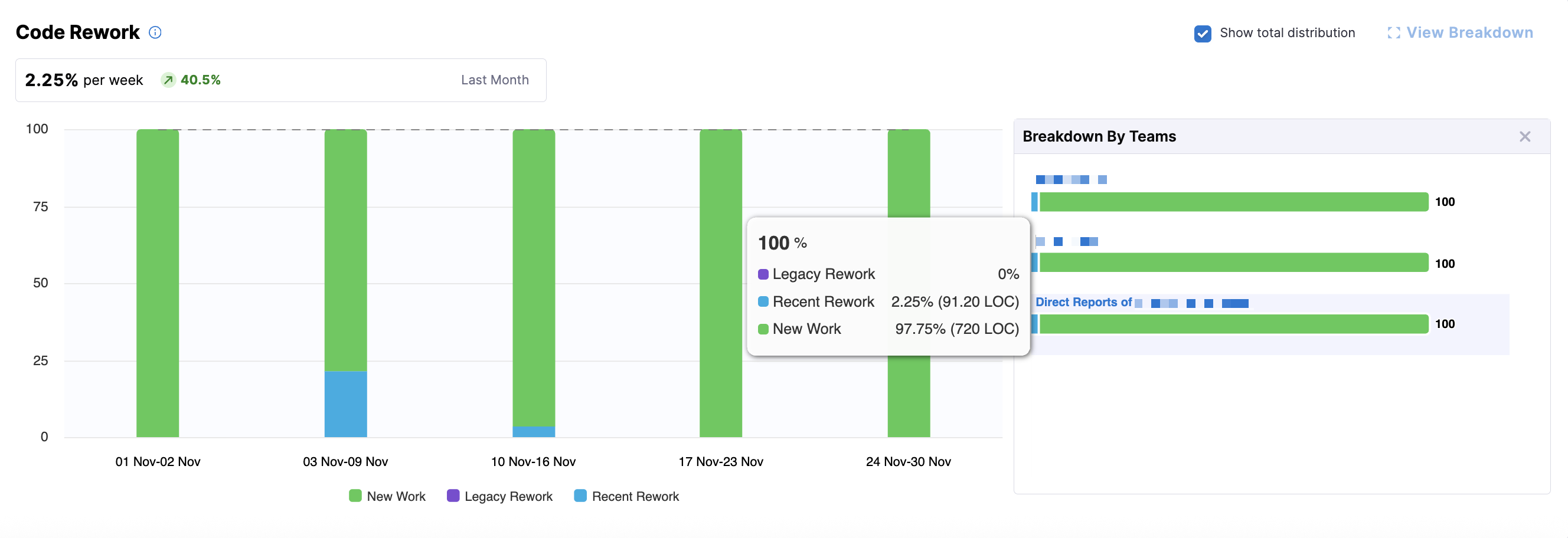
Code Rework
Code Rework is in beta. To request access, contact Harness Support.
Code Rework metrics provide insight into the portion of development effort spent rewriting or replacing existing code, and are configured in the Productivity Profile. These file-driven metrics show where rework is coming from, who is introducing it, and allow teams to balance delivering new work with maintaining code quality.
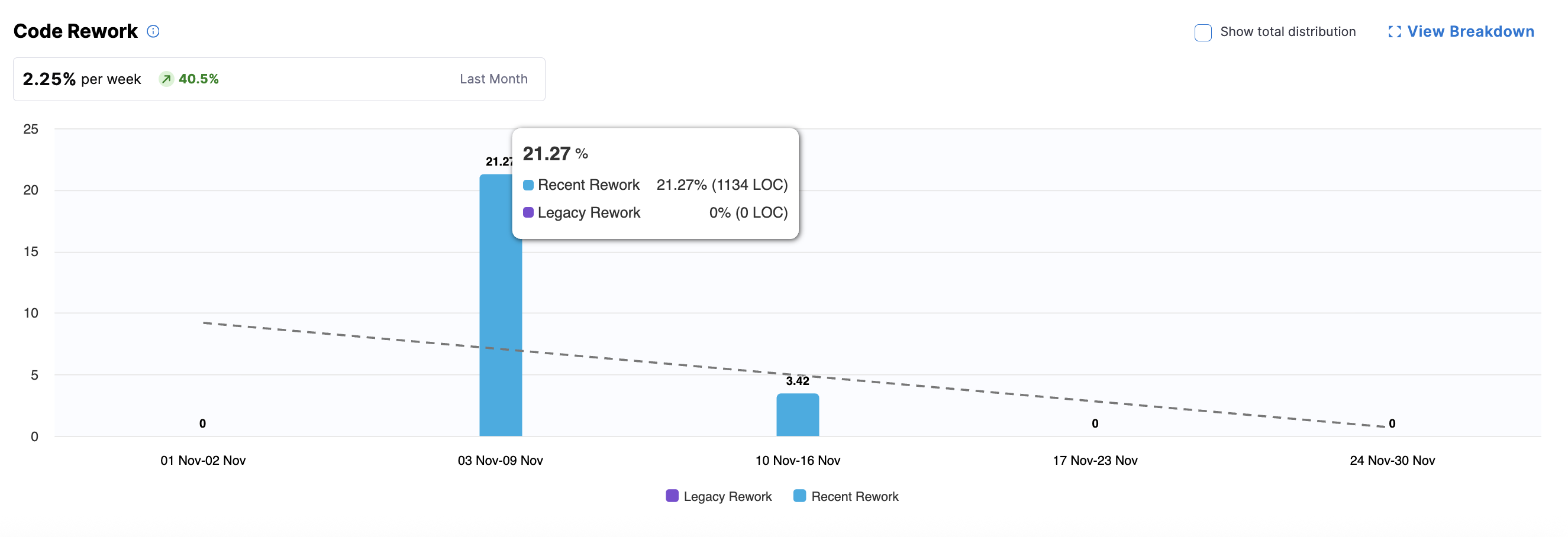
The summary metric highlight trends in code rework and the bar chart displays rework percentages over time. You can hover over a bar for a specific week to see the split of Recent Rework versus Legacy Rework.
- Recent Code: Code introduced within the past 30 days (configured in the Productivity Profile).
- Legacy Code: Code introduced before the recent-code window.
- New Work: Optional, can be displayed by clicking Show total distribution.
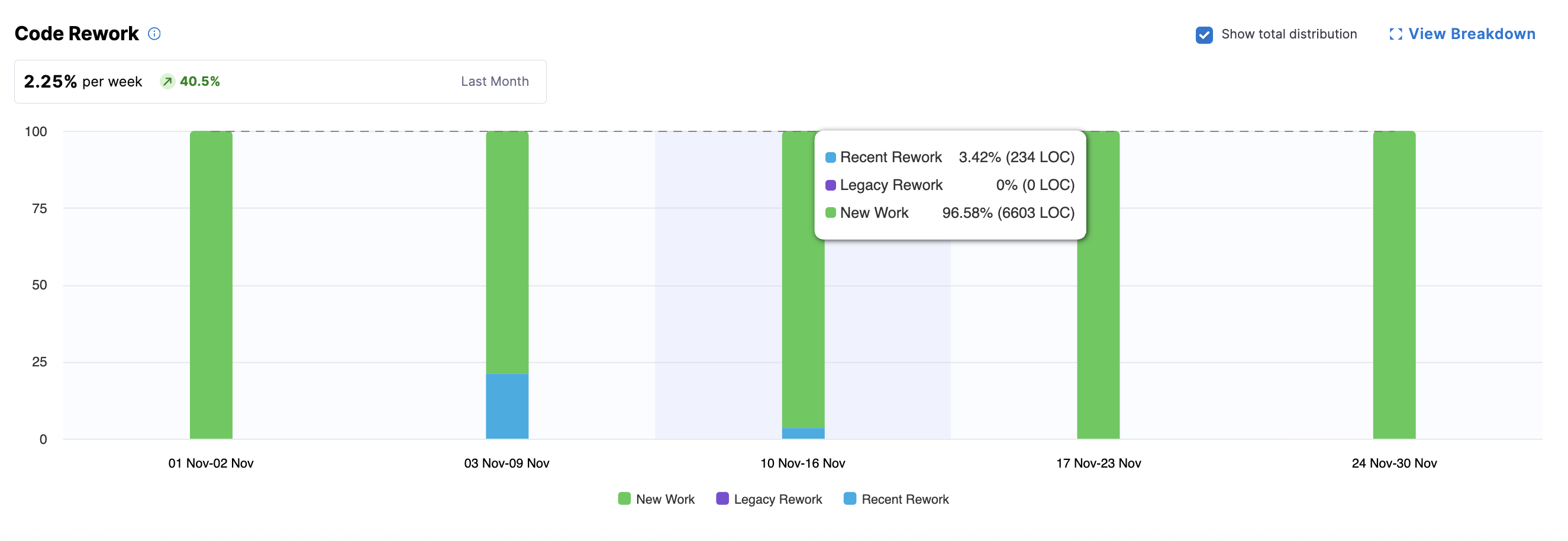
For parent nodes (e.g., directors or managers above leaf teams), the bar chart shows aggregated metrics. To view team-level details, click View Breakdown to see metrics aggregated per team (typically by engineering manager), including legacy, recent, and new work (if Show total distribution is enabled).
You can explore team-level and individual developer metrics by clicking on a team or a leaf node in the Org Tree. At the leaf team level (e.g., an engineering manager's team), you can access the Code Rework Drilldown, which displays metrics for individual developers.
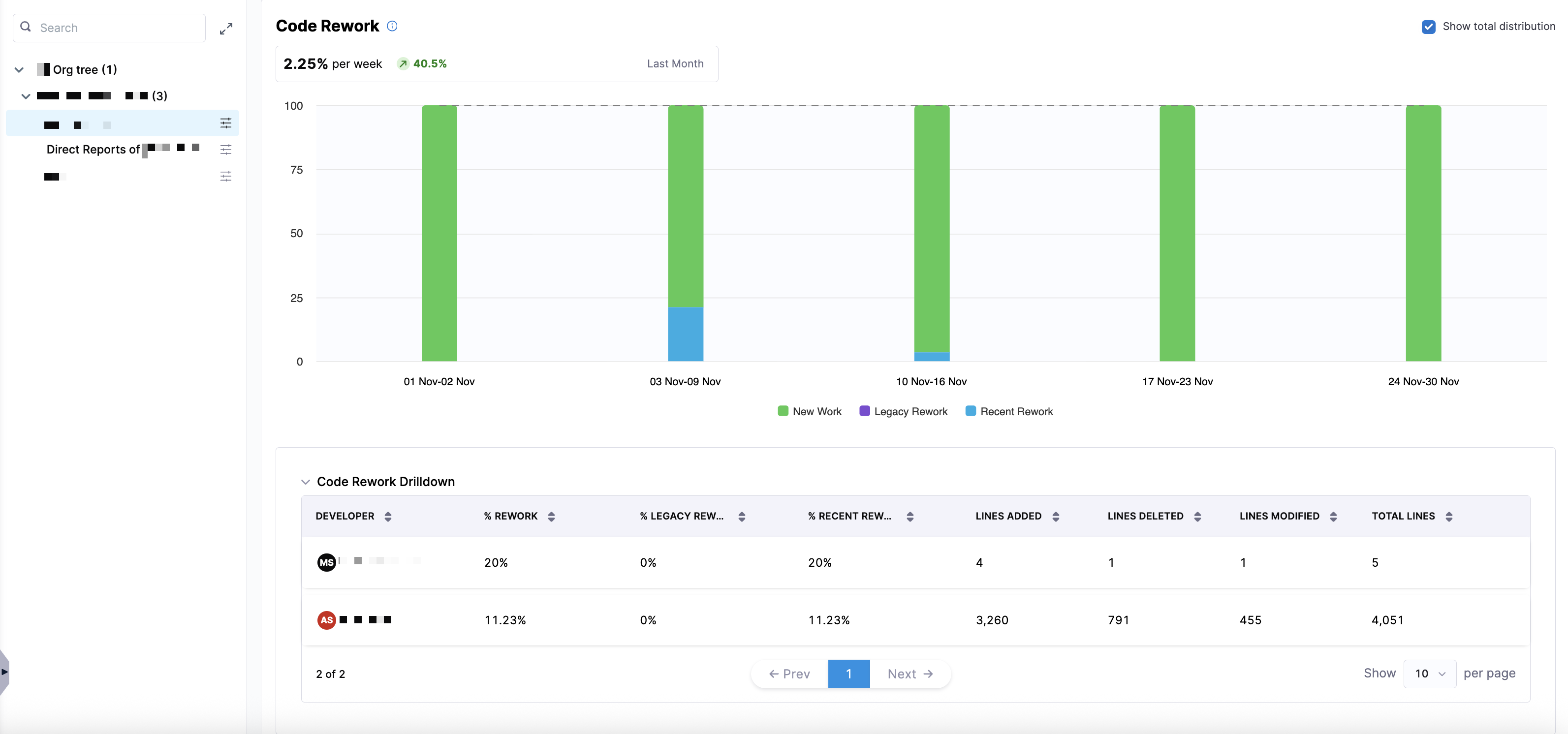
This drilldown provides analysis of who is contributing rework and where it is coming from using the following metrics:
| Metric | Description |
|---|---|
| % Rework | The percentage of work in the selected time window that involved rework (both recent and legacy). |
| % Legacy Rework | The percentage of rework that was performed on legacy code (older than the recent-code window). |
| % Recent Rework | The percentage of rework performed on recent code (introduced within the recent-code window). |
| Lines Added | The number of lines added in the code changes during the selected period. |
| Lines Deleted | The number of lines deleted in the code changes during the selected period. |
| Lines Modified | The number of lines modified (changed but not added or deleted). |
| Total Lines | The total lines affected (sum of added, deleted, and modified lines). |